Welcome to the first part of our series on working with maps in Julia! In this series we will explore how to create powerful and informative geospatial visualizations using the Julia language.
In this first post, we will learn how to create a visualization of GDP (Gross Domestic Product) by Brazilian state. The outcome will be a thematic map that graphically represents the distribution of GDP across Brazil’s federative units, using the CairoMakie library for visualization and GeoArtifacts for geographic data.
Introduction
Geographic data visualization is a powerful tool for understanding spatial patterns and trends. However, anyone searching for tutorials on Brazil map visualization in Portuguese will have mostly encountered examples in Python (with libraries like geopandas and folium) or R (with packages such as ggplot2 and sf). Documentation in Portuguese for geospatial work in Julia is still limited, which can discourage many Brazilian data analysts from exploring the full potential of this language.
This post fills that gap, showing that it is perfectly possible — and even advantageous — to work with Brazil maps in Julia. We will use packages such as CairoMakie for high-quality visualizations, GeoArtifacts for geospatial data of Brazil, and DataFrames for data manipulation.
The data used in this tutorial is available in the project repository on GitHub, where you can find the full dataset and source code used.
Prerequisites
Before starting, make sure you have the following packages installed. Below is a brief explanation of what each does:
- GeoArtifacts.jl: Provides access to geospatial datasets, including Brazil boundaries. We will use it to obtain state polygons.
- GeoInterface.jl: Defines a common interface for working with geospatial data in different formats, enabling interoperability between packages.
- CairoMakie.jl: A high-performance plotting library used to create the map. Produces publication-quality graphics.
- DataFrames.jl: Tabular data structure for manipulation and analysis.
- CSV.jl: For reading and writing CSV files containing GDP data.
- ColorSchemes.jl: Provides predefined color palettes and tools for managing color schemes.
- Colors.jl: Advanced color manipulation, including conversions between color spaces.
- Statistics.jl: Standard Julia module providing statistical functions like
mean()used to compute approximate centers.
To install all required packages, run:
using Pkg
Pkg.add(["GeoArtifacts", "GeoInterface", "CairoMakie",
         "DataFrames", "CSV", "ColorSchemes", "Colors", "Statistics"])
Step-by-step
1. Loading the Data
In this section we load GDP data from a CSV file. The file should contain at least three columns:
uf: state abbreviationano: reference yearvalor: GDP value in reals
The file is read with CSV.jl and stored in a DataFrame for easy manipulation.
2. Initial Setup
Here we import all required packages and set the visual theme for the plot. set_theme!(theme_dark()) from CairoMakie provides a dark background that helps colors stand out.
using GeoArtifacts
using GeoInterface
using CairoMakie
using DataFrames
using CSV
using ColorSchemes
using Colors
using Statistics  # Importing to use mean()

set_theme!(theme_dark())
3. Helper Functions
text_color(c)
This function determines whether text should be black or white based on background luminance to ensure legibility.
approximate_center(geom)
Calculates an approximate center point of a polygon (state) to place its abbreviation. The function:
- Extracts polygon coordinates
- Converts them to 2D points
- Computes the mean of coordinates to find a center
Here is the text color helper:
# Function to decide text color based on background luminance
function text_color(c)
    rgb = convert(RGB, c)
    luminance = 0.2126 * rgb.r + 0.7152 * rgb.g + 0.0722 * rgb.b
    return luminance > 0.6 ? RGB(0,0,0) : RGB(1,1,1)
end
And an alternate approximate center function:
# Alternate function to find an approximate center point
function approximate_center(geom)
    coords = GeoInterface.coordinates(geom)
    all_points = Vector{Point2f}()

    for poly in coords
        exterior = poly[1]
        points = Point2f.(first.(exterior), last.(exterior))
        append!(all_points, points)
    end

    # Compute mean of coordinates
    mean_x = mean([p[1] for p in all_points])
    mean_y = mean([p[2] for p in all_points])

    return Point2f(mean_x, mean_y)
end
4. Mapping States
We create a dictionary mapping full state names to their abbreviations because geographic data uses full names while the GDP dataset uses abbreviations.
A mapping dictionary:
const SIGLAS_UF = Dict(
    "Acre" => "AC",
    "Alagoas" => "AL",
    "Amapá" => "AP",
    "Amazonas" => "AM",
    "Bahia" => "BA",
    "Ceará" => "CE",
    "Distrito Federal" => "DF",
    "Espírito Santo" => "ES",
    "Goiás" => "GO",
    "Maranhão" => "MA",
    "Mato Grosso" => "MT",
    "Mato Grosso do Sul" => "MS",
    "Minas Gerais" => "MG",
    "Pará" => "PA",
    "Paraíba" => "PB",
    "Paraná" => "PR",
    "Pernambuco" => "PE",
    "Piauí" => "PI",
    "Rio de Janeiro" => "RJ",
    "Rio Grande do Norte" => "RN",
    "Rio Grande do Sul" => "RS",
    "Rondônia" => "RO",
    "Roraima" => "RR",
    "Santa Catarina" => "SC",
    "São Paulo" => "SP",
    "Sergipe" => "SE",
    "Tocantins" => "TO"
)
5. Data Processing
In this section we process the raw data:
- Filter for the year 2020
- Build a dictionary mapping each state to its GDP
- Apply a logarithmic transformation to GDP values for better visualization (large variation across states)
- Normalize values to [0,1] for color mapping
# 1. Load data
df = CSV.read("tabela5938_uf.csv", DataFrame)

# Filter for year 2020
df_2020 = filter(:ano => ==(2020), df)

# GDP dictionary by state (convert to reais)
pib_dict = Dict{String, Float64}()
for row in eachrow(df_2020)
    pib_dict[row.uf] = row.valor * 1_000  # Converting from thousands BRL to BRL
end
6. Loading and Processing Geographic Data
- Load Brazilian state geometries using
GeoBR.state() - Filter only states with available GDP values
- Extract geometries, names and abbreviations
- Apply log transform to GDP values and compute min/max for normalization
# 2. Load state geometries
estados = GeoBR.state()

# Get GDP values
pib_values = [get(pib_dict, estados.name_state[i], missing) for i in 1:length(estados.name_state)]

# Filter states with available value
has_value = .!ismissing.(pib_values)
geoms = [estados.geometry[i] for i in eachindex(estados.geometry) if has_value[i]]
pib_values = pib_values[has_value]
nomes_estados = estados.name_state[has_value]
siglas_uf = [SIGLAS_UF[name] for name in nomes_estados]

# 3. Log transform
log_pib_values = log10.(pib_values)
pib_min, pib_max = extrema(log_pib_values)
7. Color Configuration
We use the viridis color scheme for the map because it is:
- Perceptually uniform
- Colorblind-friendly
- Works well in grayscale
Map the log-transformed GDP values to colors in viridis, where lighter tones represent higher GDP.
# 4. Color setup
colors = [get(ColorSchemes.viridis, (x - pib_min) / (pib_max - pib_min)) for x in log_pib_values]
8. Creating the Visualization
This is the main part where we build the map:
- Figure setup:
- Create a figure sized 1000x900 pixels
- Set geographic limits to cover Brazil
- Configure axes with appropriate grids and ticks
- Drawing states:
- For each state, extract coordinates
- Draw polygon filled with the corresponding color
- Add a subtle black border for distinction
- Adding abbreviations:
- Compute approximate center for each state
- Choose text color (black or white) based on background luminance
- Place the state’s abbreviation at the center
- Colorbar:
- Add a side colorbar showing the color scale
- Scale shown in log10(GDP)
- Top 10 states:
- Sort states by GDP and print the top 10 in the console
- Display:
- Display the resulting figure
# 5. Map configuration
fig = Figure(size = (1000, 900))
# Brazil geographic limits
lon_min, lon_max = -75.0, -30.0
lat_min, lat_max = -35.0, 5.0
ax = Axis(fig[1, 1],
title = "GDP by State (2020) - Logarithmic Scale",
xlabel = "Longitude (West)",
ylabel = "Latitude",
aspect = DataAspect(),
limits = (lon_min, lon_max, lat_min, lat_max)
)
# Grid configuration
ax.xgridvisible = true
ax.ygridvisible = true
ax.xgridcolor = (:gray, 0.2)
ax.ygridcolor = (:gray, 0.2)
ax.xgridstyle = :dash
ax.ygridstyle = :dash
# Tick configuration
ax.xticks = -75:10:-30
ax.yticks = -35:10:5
# 6. Plot states and abbreviations
for (i, geom) in enumerate(geoms)
coords = GeoInterface.coordinates(geom)
for poly in coords
exterior = poly[1]
pontos = Point2f.(first.(exterior), last.(exterior))
poly!(ax, pontos, color = colors[i], strokecolor = (:black, 0.5), strokewidth = 0.5)
end
# Compute approximate center
center = approximate_center(geom)
# Decide text color based on state color
txt_color = text_color(colors[i])
# Add state abbreviation
text!(ax, siglas_uf[i],
position = center,
color = txt_color,
align = (:center, :center),
fontsize = 12,
font = "Arial Bold")
end
# 7. Colorbar
Colorbar(fig[1, 2],
limits = (pib_min, pib_max),
colormap = :viridis,
label = raw"log₁₀(GDP in BRL)",
width = 20,
ticks = LinearTicks(5)
)
# 8. Display top states
df_top = sort(df_2020, :valor, rev=true)
println("\nTop 10 states by GDP in 2020:")
for (i, row) in enumerate(eachrow(df_top[1:10, :]))
valor_real = row.valor * 1_000 # Convert from thousands BRL to BRL
if valor_real >= 1e12
println("$i. $(row.uf): R\$ $(round(valor_real / 1e12, digits=2)) trillion")
else
println("$i. $(row.uf): R\$ $(round(valor_real / 1e9, digits=2)) billion")
end
end
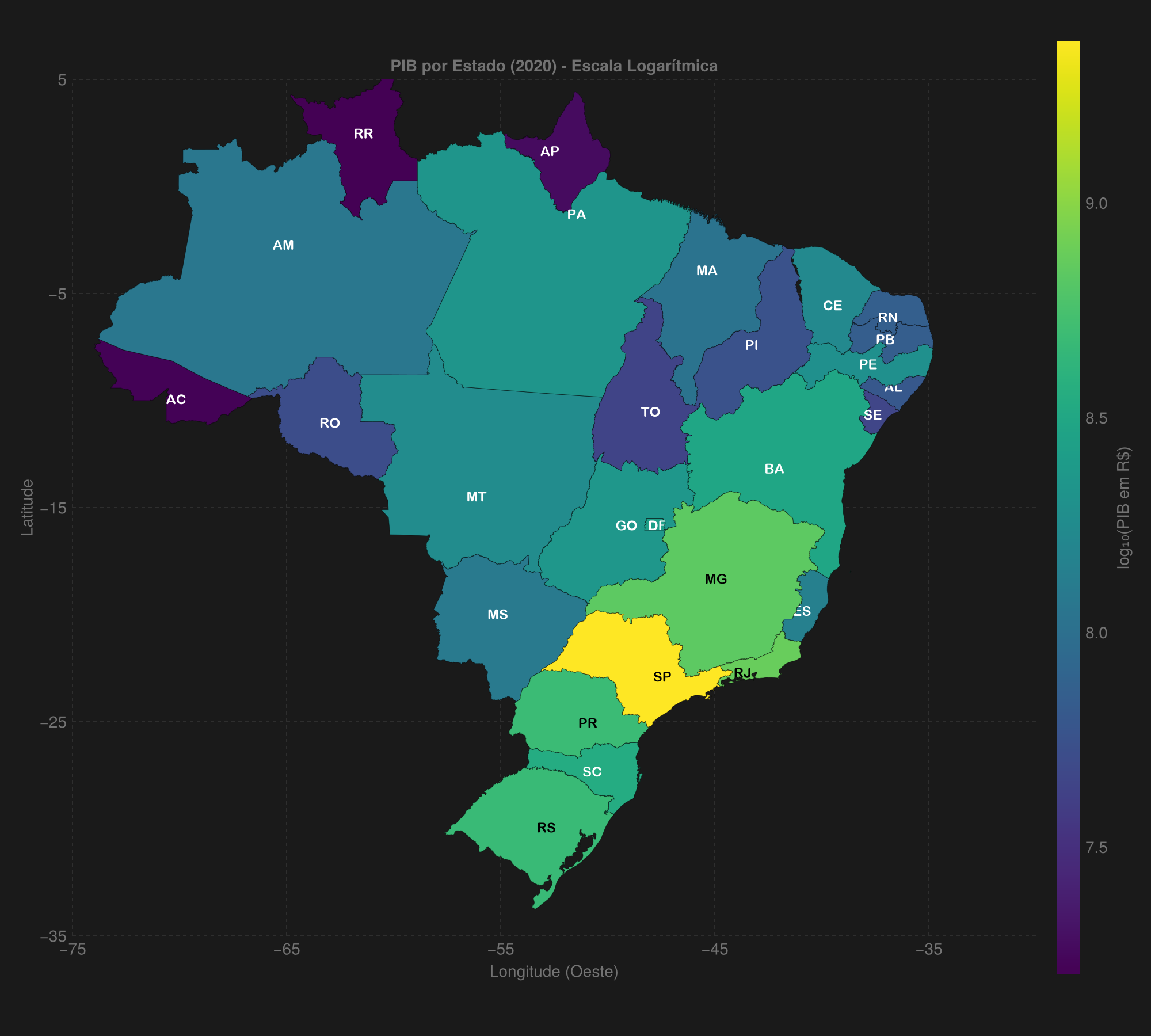
figHere is the resulting visualization:
Final Remarks
This example demonstrates how to create a geospatial visualization of Brazil’s state GDP using Julia. Some important notes:
-
Logarithmic Scale: We use a log10 scale to better visualize GDP distribution, which varies greatly across states. The transformation applied was:
\[\text{log_gdp} = \log_{10}(\text{GDP})\]Where:
- GDP is the original value in BRL
- $\log_{10}$ is the base-10 logarithm
- $\text{log_gdp}$ is the transformed value used for color mapping
-
Colors: The
viridiscolor scheme was chosen for being perceptually uniform and colorblind-friendly. -
Interactivity: The visualization can be extended to include tooltips and interactivity using Makie packages.
-
Updated Data: Make sure to use the latest IBGE data for real analyses.
The GeoBR Module
The GeoArtifacts.jl package includes the GeoBR dataset, which provides access to a variety of Brazilian geospatial data. Key available functions:
Territorial data
GeoBR.state- Brazilian state boundariesGeoBR.municipality- Municipal boundariesGeoBR.region- Regional boundariesGeoBR.country- National boundaryGeoBR.amazon- Legal Amazon areaGeoBR.biomes- Brazilian biomesGeoBR.urbanarea- Urban areasGeoBR.metropolitan_area- Metropolitan areasGeoBR.indigenousland- Indigenous landsGeoBR.conservationunits- Conservation units
Administrative divisions
GeoBR.mesoregion- MesoregionsGeoBR.microregion- MicroregionsGeoBR.intermediateregion- Intermediate regionsGeoBR.immediateregion- Immediate regionsGeoBR.municipalseat- Municipal seatsGeoBR.censustract- Census tractsGeoBR.weightingarea- Weighting areas
Specific datasets
GeoBR.healthfacilities- Health facilitiesGeoBR.schools- SchoolsGeoBR.disasterriskarea- Disaster risk areasGeoBR.semiarid- Semi-arid regionGeoBR.comparableareas- Comparable areasGeoBR.urbanconcentrations- Urban concentrationsGeoBR.poparrangements- Population arrangementsGeoBR.healthregion- Health regions
Each function allows access to official Brazilian geospatial data that can be easily integrated into analyses and visualizations like the one developed in this tutorial.
References
- GDP Data
- SIDRA/IBGE - Table 5938 - Municipal GDP data
- Packages and Tools
- GeoArtifacts.jl - Package for geospatial data artifacts in Julia
- CairoMakie.jl - High-performance plotting library
- GeoBR - R package that inspired some functionality (equivalent in R)
- Source Code Repository - Full code and dataset used in this tutorial
- Related Tutorials
- Community Discussions
- Brazil states data in Julia
- Announcement of GeoArtifacts.jl ```// filepath: c:\Users\eighi\ArquivosLocais\Documentos\MyProjects\web\morrisonkuhlsen_posts\2025-07-06-visualizacao-pib-brasil-julia.en.md — layout: post title: “Data Visualization: Brazil State GDP Map in Julia” categories: [DATA VISUALIZATION, JULIA] tags: [julia, visualization, data, economics, brazil] lang: en ref: pib-brasil-julia —
Welcome to the first part of our series on working with maps in Julia! In this series we will explore how to create powerful and informative geospatial visualizations using the Julia language.
In this first post, we will learn how to create a visualization of GDP (Gross Domestic Product) by Brazilian state. The outcome will be a thematic map that graphically represents the distribution of GDP across Brazil’s federative units, using the CairoMakie library for visualization and GeoArtifacts for geographic data.
Introduction
Geographic data visualization is a powerful tool for understanding spatial patterns and trends. However, anyone searching for tutorials on Brazil map visualization in Portuguese will have mostly encountered examples in Python (with libraries like geopandas and folium) or R (with packages such as ggplot2 and sf). Documentation in Portuguese for geospatial work in Julia is still limited, which can discourage many Brazilian data analysts from exploring the full potential of this language.
This post fills that gap, showing that it is perfectly possible — and even advantageous — to work with Brazil maps in Julia. We will use packages such as CairoMakie for high-quality visualizations, GeoArtifacts for geospatial data of Brazil, and DataFrames for data manipulation.
The data used in this tutorial is available in the project repository on GitHub, where you can find the full dataset and source code used.
Prerequisites
Before starting, make sure you have the following packages installed. Below is a brief explanation of what each does:
- GeoArtifacts.jl: Provides access to geospatial datasets, including Brazil boundaries. We will use it to obtain state polygons.
- GeoInterface.jl: Defines a common interface for working with geospatial data in different formats, enabling interoperability between packages.
- CairoMakie.jl: A high-performance plotting library used to create the map. Produces publication-quality graphics.
- DataFrames.jl: Tabular data structure for manipulation and analysis.
- CSV.jl: For reading and writing CSV files containing GDP data.
- ColorSchemes.jl: Provides predefined color palettes and tools for managing color schemes.
- Colors.jl: Advanced color manipulation, including conversions between color spaces.
- Statistics.jl: Standard Julia module providing statistical functions like
mean()used to compute approximate centers.
To install all required packages, run:
using Pkg
Pkg.add(["GeoArtifacts", "GeoInterface", "CairoMakie",
         "DataFrames", "CSV", "ColorSchemes", "Colors", "Statistics"])
Step-by-step
1. Loading the Data
In this section we load GDP data from a CSV file. The file should contain at least three columns:
uf: state abbreviationano: reference yearvalor: GDP value in reals
The file is read with CSV.jl and stored in a DataFrame for easy manipulation.
2. Initial Setup
Here we import all required packages and set the visual theme for the plot. set_theme!(theme_dark()) from CairoMakie provides a dark background that helps colors stand out.
using GeoArtifacts
using GeoInterface
using CairoMakie
using DataFrames
using CSV
using ColorSchemes
using Colors
using Statistics  # Importing to use mean()

set_theme!(theme_dark())
3. Helper Functions
text_color(c)
This function determines whether text should be black or white based on background luminance to ensure legibility.
approximate_center(geom)
Calculates an approximate center point of a polygon (state) to place its abbreviation. The function:
- Extracts polygon coordinates
- Converts them to 2D points
- Computes the mean of coordinates to find a center
Here is the text color helper:
# Function to decide text color based on background luminance
function text_color(c)
    rgb = convert(RGB, c)
    luminance = 0.2126 * rgb.r + 0.7152 * rgb.g + 0.0722 * rgb.b
    return luminance > 0.6 ? RGB(0,0,0) : RGB(1,1,1)
end
And an alternate approximate center function:
# Alternate function to find an approximate center point
function approximate_center(geom)
    coords = GeoInterface.coordinates(geom)
    all_points = Vector{Point2f}()

    for poly in coords
        exterior = poly[1]
        points = Point2f.(first.(exterior), last.(exterior))
        append!(all_points, points)
    end

    # Compute mean of coordinates
    mean_x = mean([p[1] for p in all_points])
    mean_y = mean([p[2] for p in all_points])

    return Point2f(mean_x, mean_y)
end
4. Mapping States
We create a dictionary mapping full state names to their abbreviations because geographic data uses full names while the GDP dataset uses abbreviations.
A mapping dictionary:
const SIGLAS_UF = Dict(
    "Acre" => "AC",
    "Alagoas" => "AL",
    "Amapá" => "AP",
    "Amazonas" => "AM",
    "Bahia" => "BA",
    "Ceará" => "CE",
    "Distrito Federal" => "DF",
    "Espírito Santo" => "ES",
    "Goiás" => "GO",
    "Maranhão" => "MA",
    "Mato Grosso" => "MT",
    "Mato Grosso do Sul" => "MS",
    "Minas Gerais" => "MG",
    "Pará" => "PA",
    "Paraíba" => "PB",
    "Paraná" => "PR",
    "Pernambuco" => "PE",
    "Piauí" => "PI",
    "Rio de Janeiro" => "RJ",
    "Rio Grande do Norte" => "RN",
    "Rio Grande do Sul" => "RS",
    "Rondônia" => "RO",
    "Roraima" => "RR",
    "Santa Catarina" => "SC",
    "São Paulo" => "SP",
    "Sergipe" => "SE",
    "Tocantins" => "TO"
)
5. Data Processing
In this section we process the raw data:
- Filter for the year 2020
- Build a dictionary mapping each state to its GDP
- Apply a logarithmic transformation to GDP values for better visualization (large variation across states)
- Normalize values to [0,1] for color mapping
# 1. Load data
df = CSV.read("tabela5938_uf.csv", DataFrame)

# Filter for year 2020
df_2020 = filter(:ano => ==(2020), df)

# GDP dictionary by state (convert to reais)
pib_dict = Dict{String, Float64}()
for row in eachrow(df_2020)
    pib_dict[row.uf] = row.valor * 1_000  # Converting from thousands BRL to BRL
end
6. Loading and Processing Geographic Data
- Load Brazilian state geometries using
GeoBR.state() - Filter only states with available GDP values
- Extract geometries, names and abbreviations
- Apply log transform to GDP values and compute min/max for normalization
# 2. Load state geometries
estados = GeoBR.state()

# Get GDP values
pib_values = [get(pib_dict, estados.name_state[i], missing) for i in 1:length(estados.name_state)]

# Filter states with available value
has_value = .!ismissing.(pib_values)
geoms = [estados.geometry[i] for i in eachindex(estados.geometry) if has_value[i]]
pib_values = pib_values[has_value]
nomes_estados = estados.name_state[has_value]
siglas_uf = [SIGLAS_UF[name] for name in nomes_estados]

# 3. Log transform
log_pib_values = log10.(pib_values)
pib_min, pib_max = extrema(log_pib_values)
7. Color Configuration
We use the viridis color scheme for the map because it is:
- Perceptually uniform
- Colorblind-friendly
- Works well in grayscale
Map the log-transformed GDP values to colors in viridis, where lighter tones represent higher GDP.
# 4. Color setup
colors = [get(ColorSchemes.viridis, (x - pib_min) / (pib_max - pib_min)) for x in log_pib_values]
8. Creating the Visualization
This is the main part where we build the map:
- Figure setup:
- Create a figure sized 1000x900 pixels
- Set geographic limits to cover Brazil
- Configure axes with appropriate grids and ticks
- Drawing states:
- For each state, extract coordinates
- Draw polygon filled with the corresponding color
- Add a subtle black border for distinction
- Adding abbreviations:
- Compute approximate center for each state
- Choose text color (black or white) based on background luminance
- Place the state’s abbreviation at the center
- Colorbar:
- Add a side colorbar showing the color scale
- Scale shown in log10(GDP)
- Top 10 states:
- Sort states by GDP and print the top 10 in the console
- Display:
- Display the resulting figure
# 5. Map configuration
fig = Figure(size = (1000, 900))

# Brazil geographic limits
lon_min, lon_max = -75.0, -30.0
lat_min, lat_max = -35.0, 5.0

ax = Axis(fig[1, 1],
    title = "GDP by State (2020) - Logarithmic Scale",
    xlabel = "Longitude (West)",
    ylabel = "Latitude",
    aspect = DataAspect(),
    limits = (lon_min, lon_max, lat_min, lat_max)
)

# Grid configuration
ax.xgridvisible = true
ax.ygridvisible = true
ax.xgridcolor = (:gray, 0.2)
ax.ygridcolor = (:gray, 0.2)
ax.xgridstyle = :dash
ax.ygridstyle = :dash

# Tick configuration
ax.xticks = -75:10:-30
ax.yticks = -35:10:5

# 6. Plot states and abbreviations
for (i, geom) in enumerate(geoms)
    coords = GeoInterface.coordinates(geom)
    for poly in coords
        exterior = poly[1]
        pontos = Point2f.(first.(exterior), last.(exterior))
        poly!(ax, pontos, color = colors[i], strokecolor = (:black, 0.5), strokewidth = 0.5)
    end

    # Compute approximate center
    center = approximate_center(geom)

    # Decide text color based on state color
    txt_color = text_color(colors[i])

    # Add state abbreviation
    text!(ax, siglas_uf[i],
        position = center,
        color = txt_color,
        align = (:center, :center),
        fontsize = 12,
        font = "Arial Bold")
end

# 7. Colorbar
Colorbar(fig[1, 2],
    limits = (pib_min, pib_max),
    colormap = :viridis,
    label = raw"log₁₀(GDP in BRL)",
    width = 20,
    ticks = LinearTicks(5)
)

# 8. Display top states
df_top = sort(df_2020, :valor, rev=true)
println("\nTop 10 states by GDP in 2020:")

for (i, row) in enumerate(eachrow(df_top[1:10, :]))
    valor_real = row.valor * 1_000  # Convert from thousands BRL to BRL
    if valor_real >= 1e12
        println("$i. $(row.uf): R\$ $(round(valor_real / 1e12, digits=2)) trillion")
    else
        println("$i. $(row.uf): R\$ $(round(valor_real / 1e9, digits=2)) billion")
    end
end

fig
Here is the resulting visualization:
Final Remarks
This example demonstrates how to create a geospatial visualization of Brazil’s state GDP using Julia. Some important notes:
-
Logarithmic Scale: We use a log10 scale to better visualize GDP distribution, which varies greatly across states. The transformation applied was:
\[\text{log_gdp} = \log_{10}(\text{GDP})\]Where:
- GDP is the original value in BRL
- $\log_{10}$ is the base-10 logarithm
- $\text{log_gdp}$ is the transformed value used for color mapping
-
Colors: The
viridiscolor scheme was chosen for being perceptually uniform and colorblind-friendly. -
Interactivity: The visualization can be extended to include tooltips and interactivity using Makie packages.
-
Updated Data: Make sure to use the latest IBGE data for real analyses.
The GeoBR Module
The GeoArtifacts.jl package includes the GeoBR dataset, which provides access to a variety of Brazilian geospatial data. Key available functions:
Territorial data
GeoBR.state- Brazilian state boundariesGeoBR.municipality- Municipal boundariesGeoBR.region- Regional boundariesGeoBR.country- National boundaryGeoBR.amazon- Legal Amazon areaGeoBR.biomes- Brazilian biomesGeoBR.urbanarea- Urban areasGeoBR.metropolitan_area- Metropolitan areasGeoBR.indigenousland- Indigenous landsGeoBR.conservationunits- Conservation units
Administrative divisions
GeoBR.mesoregion- MesoregionsGeoBR.microregion- MicroregionsGeoBR.intermediateregion- Intermediate regionsGeoBR.immediateregion- Immediate regionsGeoBR.municipalseat- Municipal seatsGeoBR.censustract- Census tractsGeoBR.weightingarea- Weighting areas
Specific datasets
GeoBR.healthfacilities- Health facilitiesGeoBR.schools- SchoolsGeoBR.disasterriskarea- Disaster risk areasGeoBR.semiarid- Semi-arid regionGeoBR.comparableareas- Comparable areasGeoBR.urbanconcentrations- Urban concentrationsGeoBR.poparrangements- Population arrangementsGeoBR.healthregion- Health regions
Each function allows access to official Brazilian geospatial data that can be easily integrated into analyses and visualizations like the one developed in this tutorial.
References
- GDP Data
- SIDRA/IBGE - Table 5938 - Municipal GDP data
- Packages and Tools
- GeoArtifacts.jl - Package for geospatial data artifacts in Julia
- CairoMakie.jl - High-performance plotting library
- GeoBR - R package that inspired some functionality (equivalent in R)
- Source Code Repository - Full code and dataset used in this tutorial
- Related Tutorials
- Community Discussions